client: Susan Little Childbirth Services
Brand Identity Design for a Fractional Product Leader Calgary

Brand Design • Visual Identity • Brand Strategy
Get Sortd helps growing businesses navigate complexity, align priorities, and create the systems needed to move forward with confidence.
Tara wanted a brand that reflected both her strategic expertise and her approachable leadership style. As a Fractional Product Leader, she works with founders and teams to bring clarity to competing priorities, improve decision-making, and create momentum around the work that matters most.
The visual direction needed to feel professional and credible within the technology space while avoiding the overly corporate, blue-heavy aesthetic often found within the industry. The result is a brand that feels thoughtful, modern, and distinctly her own.
about the experience
The Brand Alignment Suite Process
Every Brand Alignment Suite includes the development of three distinct brand directions.
Rather than refining a single logo concept, I explore multiple strategic approaches that allow clients to see different expressions of their business before moving into refinement.
Each concept includes:
✓ Primary logo design
✓ Supporting logo variations
✓ Colour palette exploration
✓ Typography recommendations
✓ Moodboard direction
✓ Strategic rationale
The goal isn't simply to choose a logo.
The goal is to create a brand that feels deeply aligned with both the business owner and the clients they serve.
Concept One
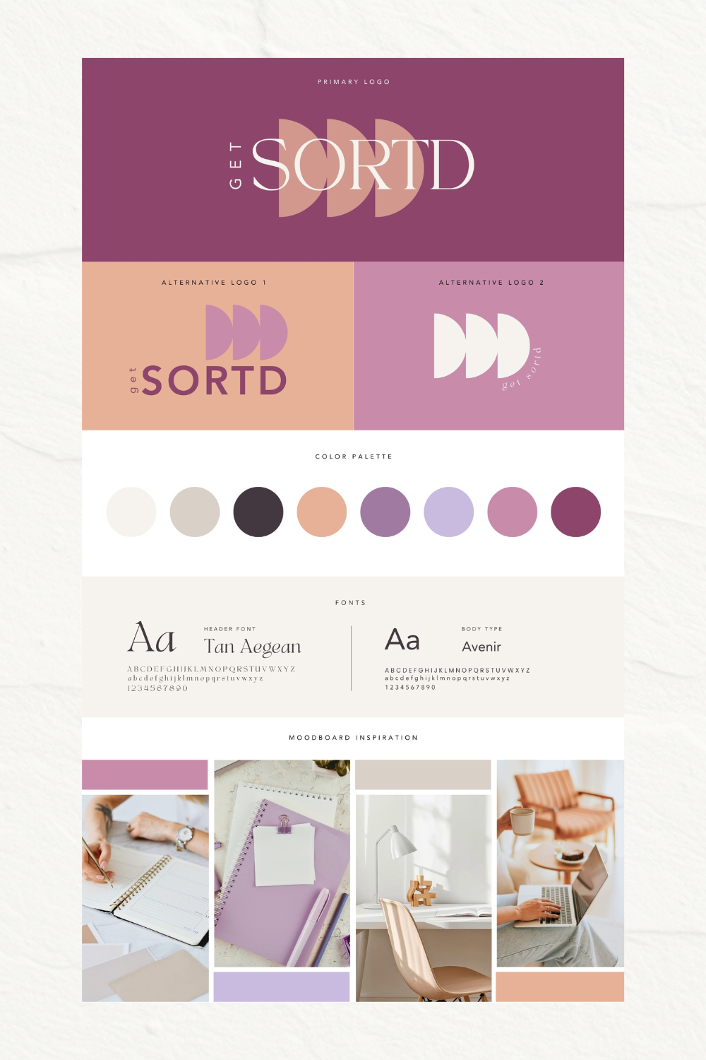
Connected Priorities
Clarity Through Focus
The first concept explored the idea that meaningful progress happens when the right priorities are identified and given space to move forward.
The repeated form symbol represents:
Prioritization
Direction
Forward momentum
Simplifying complexity
The mauve and lavender palette introduced a softer, more distinctive presence within a traditionally blue technology landscape while maintaining professionalism and credibility.
This direction positioned Get Sortd as a strategic guide who helps businesses cut through noise, focus on what matters most, and create sustainable progress.
Concept Two
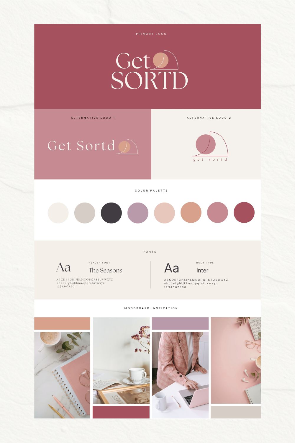
Strategic Alignment
Bringing the Right Pieces Together
The second concept focused on the idea of alignment.
The overlapping circular forms represented the intersection between people, priorities, systems, and business goals.
Rather than solving problems in isolation, this concept emphasized the value of bringing multiple perspectives together to create clarity.
The warm rose palette created an approachable and collaborative feel while maintaining a strong sense of expertise.
This direction reflected Tara's ability to help teams navigate competing priorities and move toward shared outcomes.
Concept Three
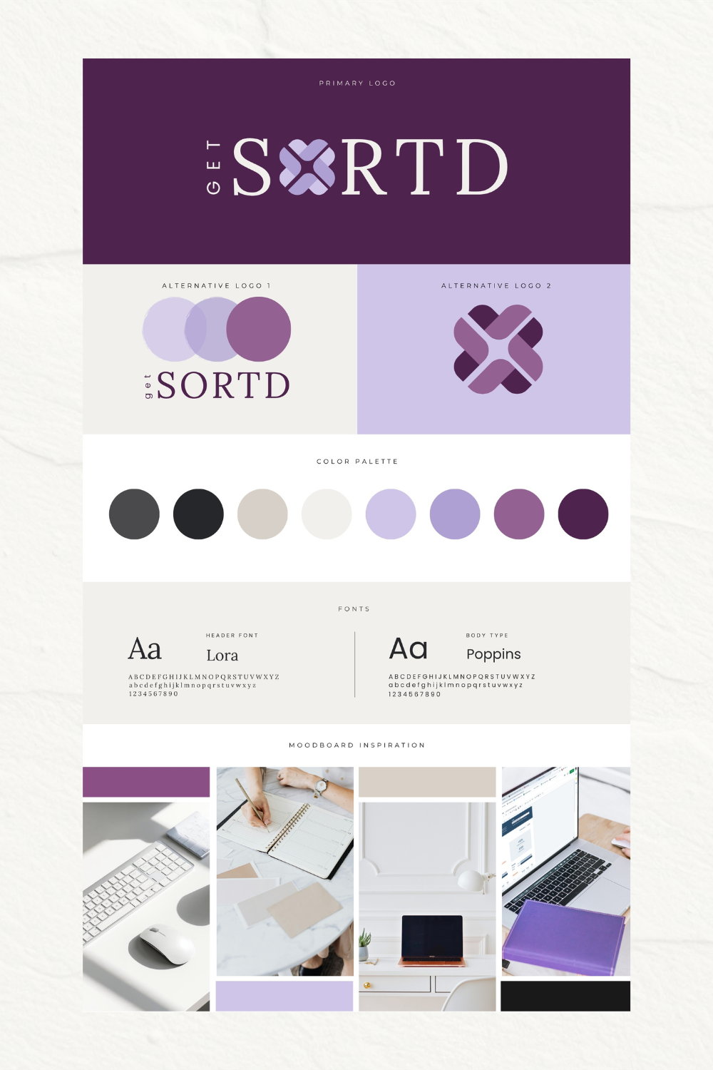
Connected Systems
Where Strategy Meets Simplicity
The third concept explored the relationship between structure and flexibility.
The woven symbol represents integration, collaboration, and the process of bringing multiple moving pieces into alignment. It reflects the way successful products, teams, and businesses rely on connected systems rather than isolated solutions.
The deeper purple palette created a confident and recognizable visual identity while standing apart from more traditional technology brands.
This direction positioned Get Sortd as a thoughtful strategic partner who helps organizations create clarity, alignment, and meaningful forward momentum.
Final Direction
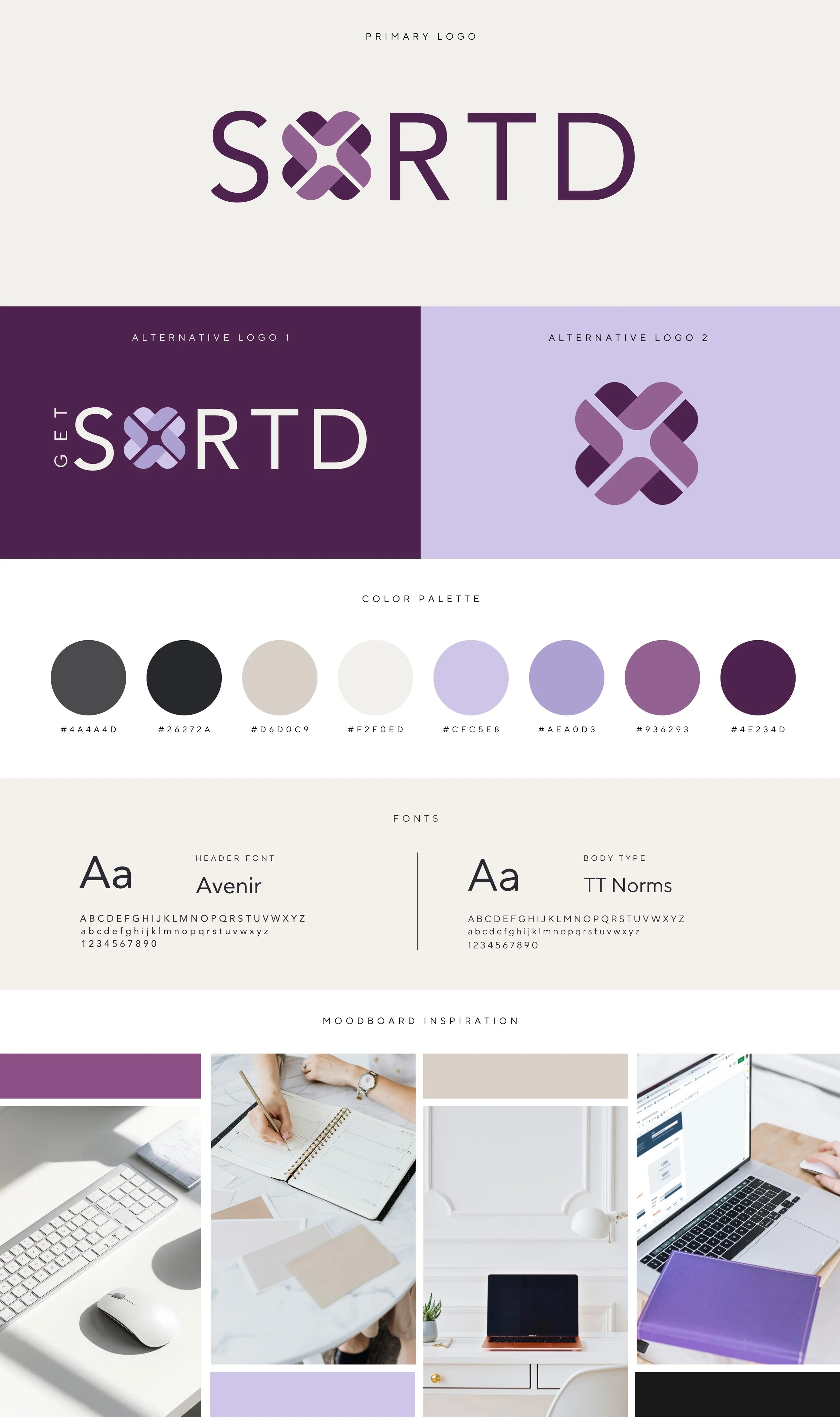
Connected Systems
After exploring all three concepts, Tara ultimately selected the Connected Systems direction as the foundation for the final brand identity.
While several visual directions resonated throughout the process, the final concept felt like the strongest reflection of both her personality and the way she works with clients.
The final brand balances:
Professionalism
Clarity
Strategic thinking
Approachability
Modern leadership
The purple palette creates distinction within the technology space while introducing warmth, personality, and confidence. Paired with clean typography and a modern emblem, the final identity feels clear, intentional, and highly adaptable across platforms.
Rather than positioning Get Sortd as another technology consultant, the final identity communicates the deeper value behind Tara's work: helping businesses move through complexity, align around priorities, and focus their energy where it will have the greatest impact.
The resulting visual identity now supports:
Website design
LinkedIn and professional profiles
Presentation materials
Client resources
Future business growth
Most importantly, it helps prospective clients immediately understand what Tara brings to the table: clarity, confidence, and a thoughtful path forward.
Take The Next Step