client: Sorted by joy
Brand Identity Design for a Canadian Home Organization Business

Brand Design • Visual Identity • Brand Strategy
Sorted by Joy helps busy homeowners create calmer, more functional spaces through professional home organization services.
Amanda wanted a brand that felt approachable, trustworthy, and welcoming while reflecting the transformation her clients experience when their homes become more organized and intentional.
The visual direction needed to balance professionalism with warmth, helping clients feel supported rather than judged as they begin the organizing process.

about the experience
The Brand Alignment Suite Process
Every Brand Alignment Suite includes the development of three distinct brand directions.
Rather than refining a single logo concept, I explore multiple strategic approaches that allow clients to see different expressions of their business before moving into refinement.
Each concept includes:
✓ Primary logo design
✓ Supporting logo variations
✓ Colour palette exploration
✓ Typography recommendations
✓ Moodboard direction
✓ Strategic rationale
The goal isn't simply to choose a logo.
The goal is to create a brand that feels deeply aligned with both the business owner and the clients they serve.

"It’s honestly better than I could have imagined.”
“You've made the entire process feel so approachable and enjoyable, and I truly appreciate all of the care, thought, and attention you've put into every detail."
-Amanda, Sorted by Joy
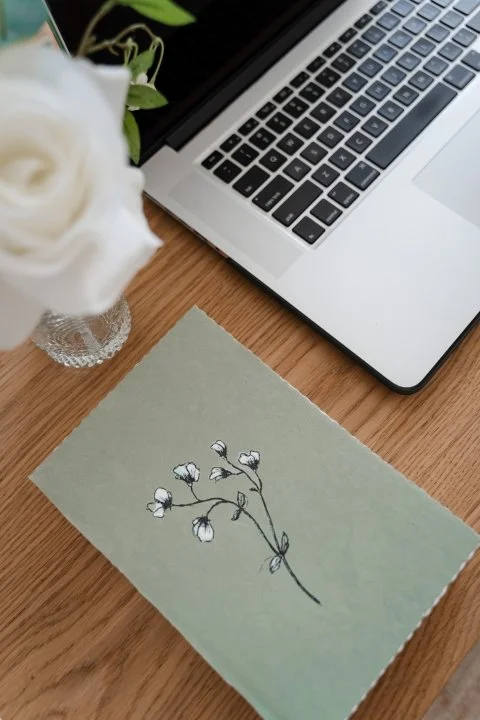
Concept One
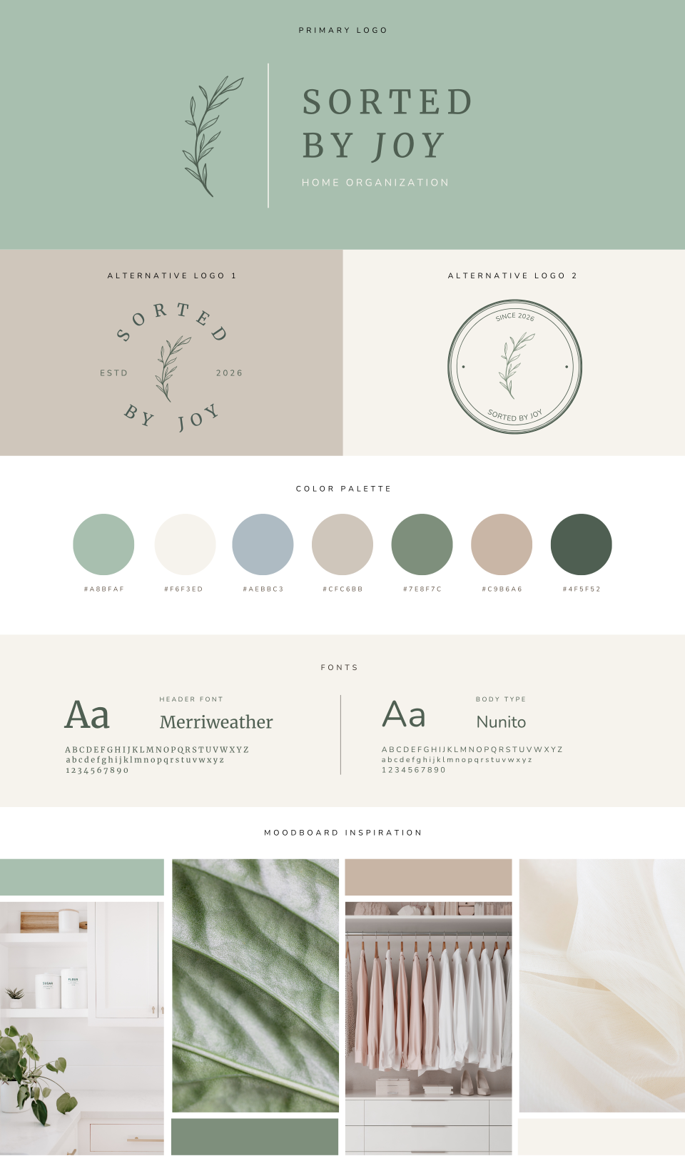
The Branch
Calm, Growth & Simplicity
The first concept explored the idea that organization creates room for growth.
The delicate branch symbol represents:
Intentional progress
Simplicity
Fresh starts
Gentle transformation
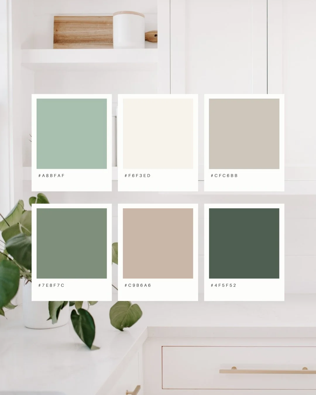
Soft sage greens, warm neutrals, and natural textures were selected to create a sense of calm and ease.
The typography feels refined yet approachable, helping the brand appear professional without becoming overly corporate.
This direction positions home organization as a supportive, peaceful process rather than an overwhelming task.
Concept Two
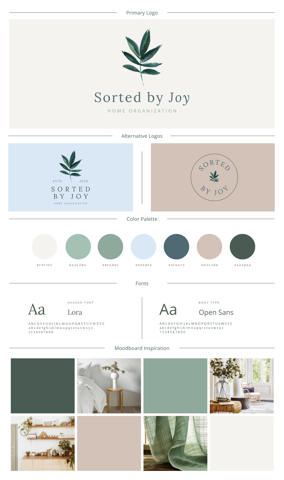
The Watercolour Leaf
Natural Transformation
The second concept leaned more heavily into organic and artistic influences.
The hand-painted leaf introduced movement and softness, symbolizing:
Renewal
Growth
Positive change
Personal transformation
The addition of muted blue tones created a sense of calm while differentiating the brand from many home organization businesses that rely heavily on beige palettes.
This concept emphasized the emotional experience of coming home to a space that feels lighter, calmer, and more supportive.
Concept Three
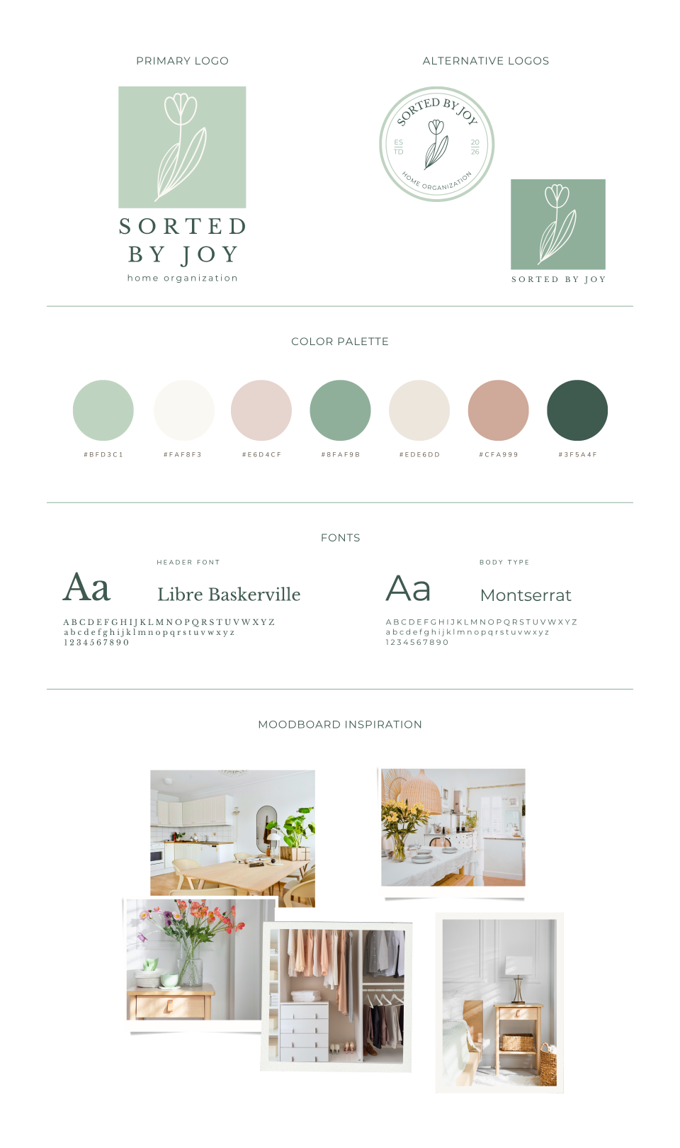
The Tulip
Joy, Fresh Beginnings & Home
The third concept explored a more playful and uplifting direction.
The tulip became a symbol of:
Joy
Care
Fresh beginnings
Everyday beauty
The softer pastel palette introduced warmth and optimism while maintaining a clean, organized aesthetic.
This direction reflected the emotional reward clients experience after transforming their spaces and aligned closely with the "Joy" element of the business name.
Final Direction
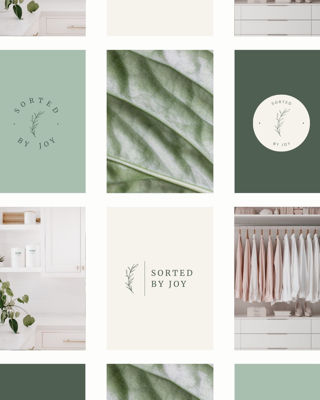
The Branch Concept
Amanda ultimately selected Concept One as the foundation for the final brand identity.
The branch felt like the strongest reflection of both her personality and the experience she wanted clients to have when working with Sorted by Joy.
The final brand balances:
Professionalism
Warmth
Simplicity
Trust
Growth
The sage and neutral palette creates a sense of calm while the botanical details add softness and humanity.
Rather than focusing solely on organization systems, the final identity communicates the deeper transformation behind Amanda's work: helping people create homes that feel lighter, easier to maintain, and more supportive of everyday life.
The resulting visual identity now supports:
Website design
Social media
Marketing materials
Client resources
Future business growth
Most importantly, it helps prospective clients feel welcomed, understood, and encouraged before they ever make contact.
Take The Next Step