client: Susan Little Childbirth Services
Brand Identity Design for an Calgary, Alberta Holistic Doula
scope: Brand Design • Visual Identity • Brand Strategy
Susan Little Childbirth Services provides compassionate, holistic doula support for families throughout Carstairs, Airdrie, Olds, and surrounding Alberta communities.
As part of a complete brand and website project, the goal was to create a visual identity that felt nurturing, trustworthy, grounded, and deeply reflective of Susan's approach to care.
Drawing inspiration from Susan's New Zealand heritage, the concepts explored themes of growth, new beginnings, connection, and gentle guidance — all qualities present in her work supporting families through fertility, birth, postpartum, and loss.
about the experience
The Brand Alignment Suite Process
Every Brand Alignment Suite includes the development of three distinct brand directions.
Rather than refining a single logo concept, I explore multiple strategic approaches that allow clients to see different expressions of their business before moving into refinement.
Each concept includes:
✓ Primary logo design
✓ Supporting logo variations
✓ Colour palette exploration
✓ Typography recommendations
✓ Moodboard direction
✓ Strategic rationale
The goal isn't simply to choose a logo.
It's to uncover the visual language that feels most aligned with the business being built.
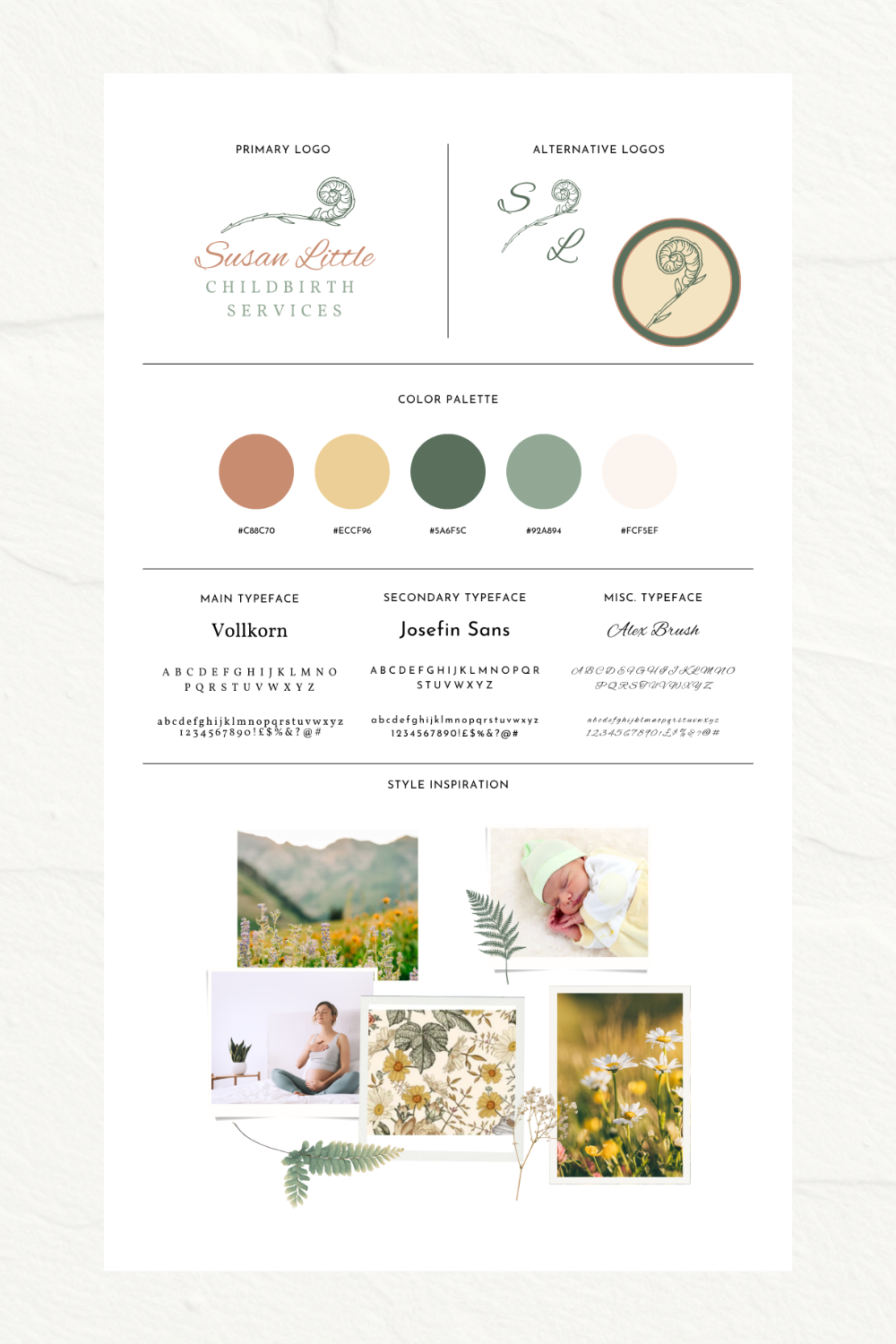
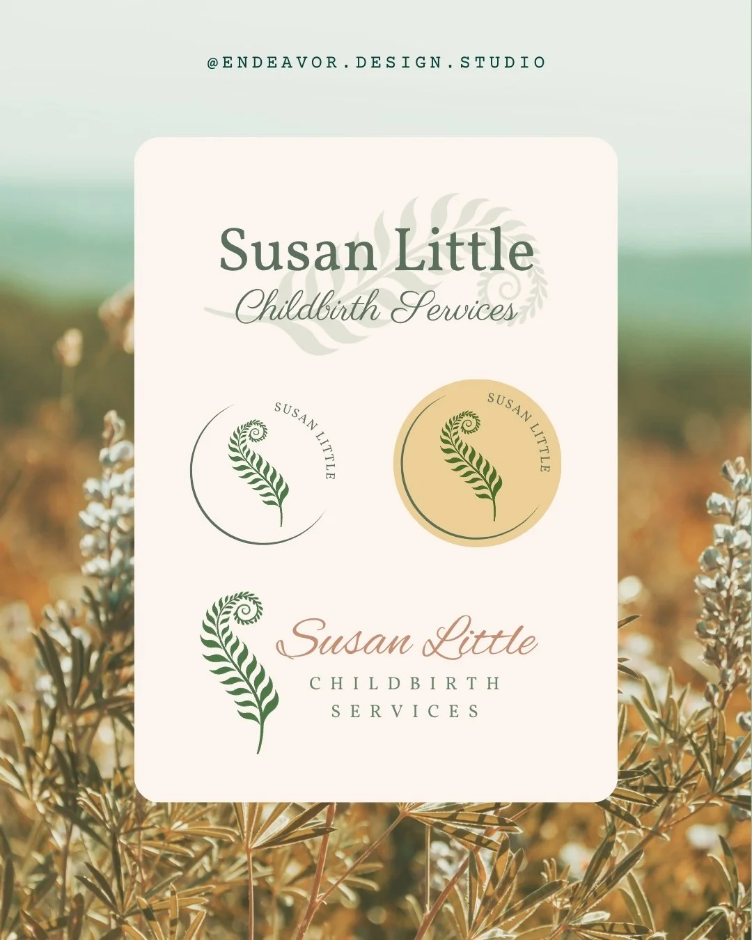
Concept One
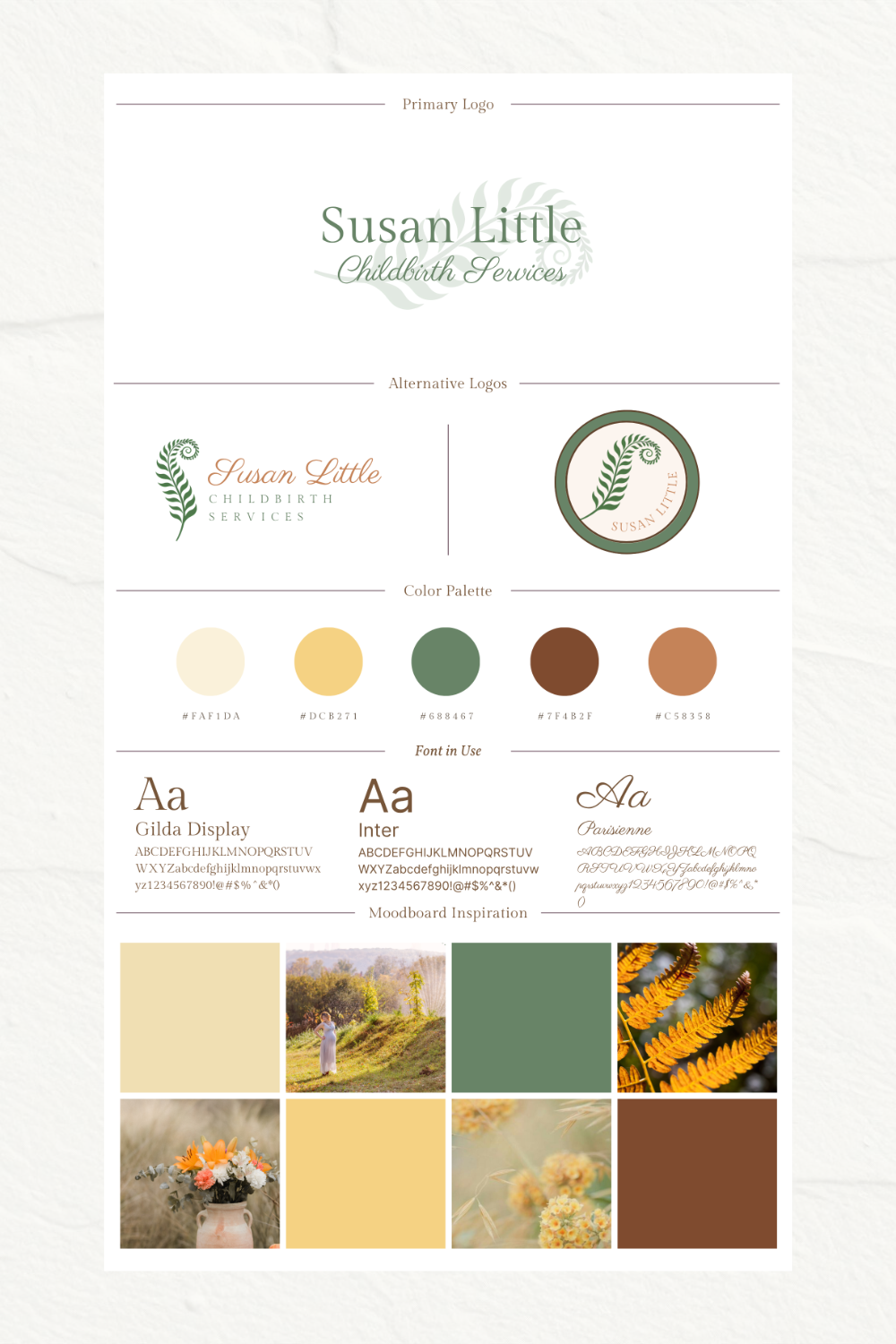
The Koru
Inspired by Growth, Nurturing & New Beginnings
This concept drew directly from the New Zealand koru, a symbol based on the unfurling silver fern.
Traditionally, the koru represents:
New life
Growth
Renewal
Continuous care
Connection across generations
The visual direction combines soft botanical details with warm earthy colours inspired by Alberta landscapes and natural motherhood imagery.
The typography balances elegance and approachability, creating a brand that feels nurturing, established, and welcoming.
This direction was designed to feel deeply personal and symbolic while immediately communicating themes of birth, growth, and support.
Concept Two
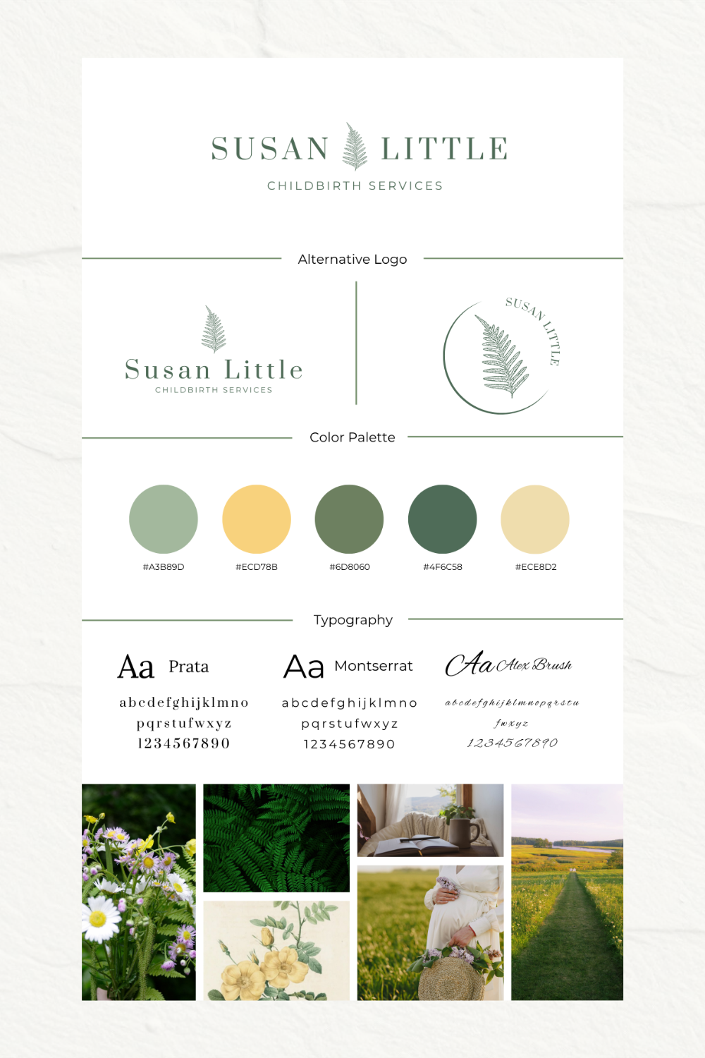
The Fern
Calm, Grounded & Professional
This concept explored a more refined and minimalist interpretation of the fern motif.
Rather than focusing on symbolism first, the emphasis was placed on clarity, professionalism, and longevity.
The clean typography and simplified fern mark create a visual identity that feels:
Trustworthy
Established
Peaceful
Timeless
The muted green palette was selected to evoke calm and reassurance while maintaining a polished, professional appearance.
This concept would have positioned Susan as a modern, evidence-informed practitioner while still retaining warmth and approachability.
Concept Three
The Caregiver
Warmth, Humanity & Personal Connection
The third direction explored a softer and more handcrafted aesthetic.
Inspired by wildflowers, motherhood, and the natural rhythms of family life, this concept leaned into emotional connection and nurturing support.
The flowing typography and warm colour palette create a feeling of:
Compassion
Gentleness
Encouragement
Human connection
This direction was intentionally designed to feel approachable and comforting for families entering a significant life transition.
Final Direction
The Koru Concept
After reviewing all three directions, Susan selected the first concept as the foundation for her final brand identity.
The koru held special significance because of its connection to her New Zealand heritage while also beautifully reflecting the journey of birth, growth, and ongoing support.
The final identity balances:
Meaningful symbolism
Professional credibility
Warmth and approachability
Long-term flexibility
The resulting brand feels calm, grounded, and deeply aligned with Susan's values and the experience she creates for families.
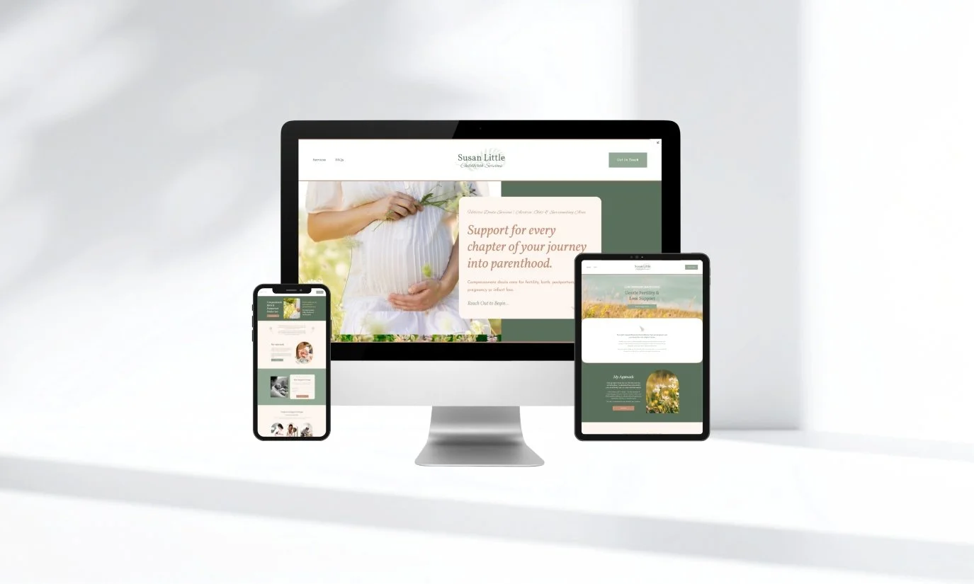
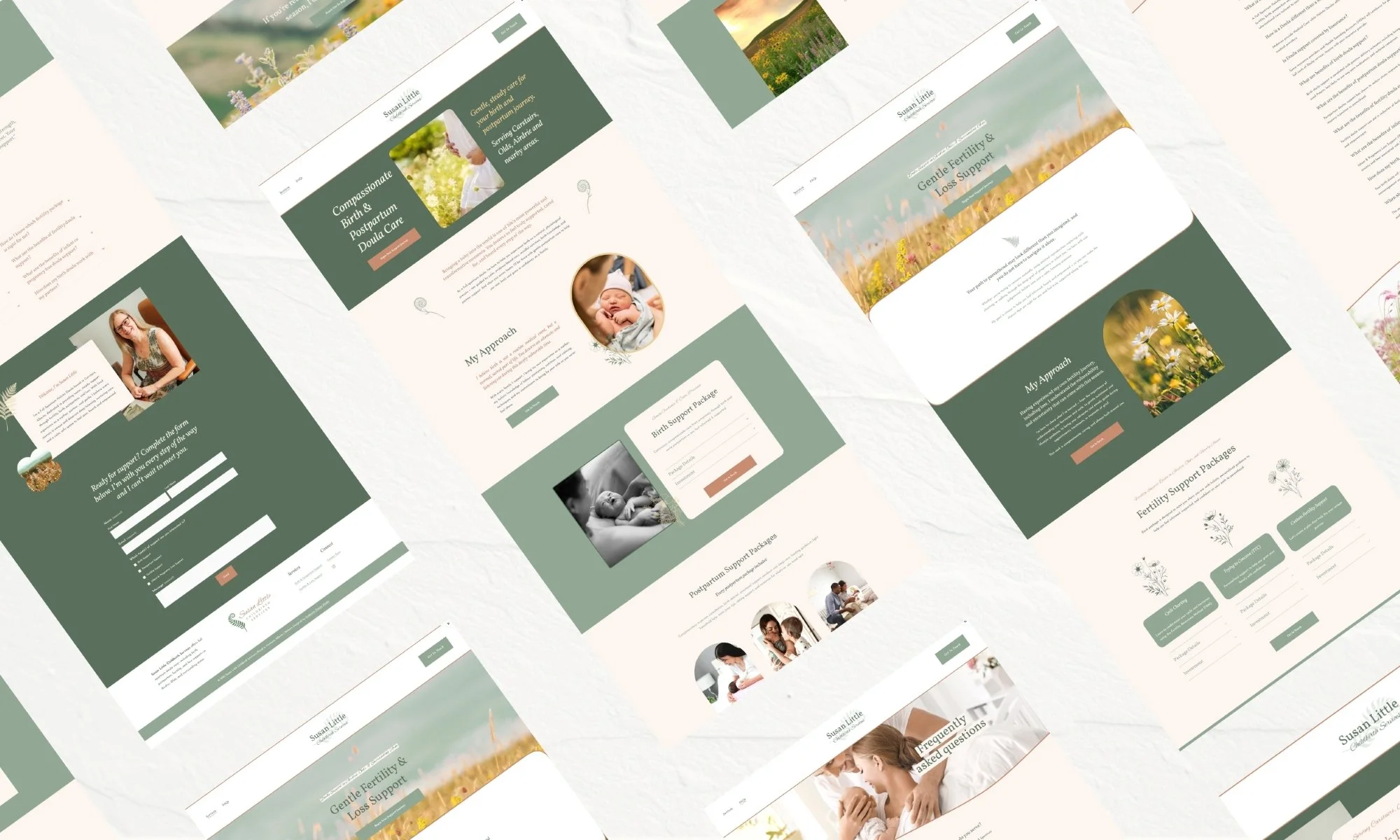
The visual system now supports her across:
Website design
Social media
Print materials
Client resources
Future business growth
Most importantly, it creates an immediate sense of trust and reassurance for families seeking support during one of life's most important seasons.
Take The Next Step