Color Theory for Small Business Owners: How to Choose Brand Colors That Connect

If you’ve ever jumped into your Canva files with zest to start designing your brand, and then felt completely stuck on which colors to use, you are not alone.
For small business owners like us, brand colors are often one of the first ways people connect with our work. The right palette shouldn’t just look pleasing to the eye. It should communicate mood, sets expectations, and quietly tells your dream clients, “You are in the right place.”
That is where color theory comes in.
This guide will walk you through the essentials of color theory and how to apply it when you are choosing colors for your website, your brand, or even your Instagram feed.
What I’ll Share in This Article:
What color theory means and how it applies to branding and web design.
The difference between hues, tints, shades, and tones in color theory.
The connection between color theory and color psychology in small business branding.
Why choosing intentional brand colors impacts your website, logo, and overall brand identity.
Practical steps to choose brand colors that connect with your dream clients.
Real-life examples of calming color palettes versus bold, energetic palettes.
At its core, color theory is the study of how colors work together.
First, What Is Color Theory?
It explains how they mix, match, and create harmony or contrast.
Designers use it as a framework to build palettes that feel intentional instead of random. Even if you are not a designer, understanding a few basics will save you hours of frustration. It will also make sure your brand does not accidentally feel chaotic when you are going for calm and trustworthy.
Think of it like making a mixtape in 2004. You would never just throw random songs on there. You wanted the whole playlist to flow. Your brand colors work the exact same way.
The Color Wheel (Your New Best Friend)
Remember art class? Red, yellow, and blue are the primaries. Mix them, and you get everything else (or a messy mix of brown as I so often learned lol).
The color wheel is a simple tool that shows how colors relate:
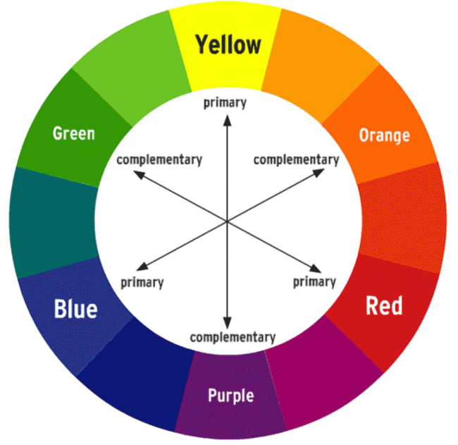
Complementary colors are opposite each other, like blue and orange. They create bold, high-contrast, attention-grabbing combinations.
Analogous colors sit next to each other, like green and blue. They feel calming, harmonious, and safe.
Monochromatic colors are based on one base color, but with lighter tints and darker shades. This creates a clean, minimal, soothing look.
When you translate this to branding, complementary is your pop star moment (think Destiny’s Child in bold metallics). Analogous is your chill acoustic playlist (like early John Mayer). Monochromatic is your minimal chic look (hello, Olsen twins in their muted 2000’s wardrobe).
Hue, Tint, Shade, Tone Made Simple
Here is the quick version without the jargon:
Hue is the pure base color, like red, blue, or green.
Tint is that color mixed with white, which creates soft, airy, pastel vibes.
Shade is that color mixed with black, which feels moody, dramatic, and luxe.
Tone is that color mixed with gray, which gives a muted, subtle, and sophisticated effect.
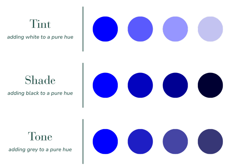
Why this matters: picking between a tint, shade, or tone can completely change how your brand feels. Think of blush pink versus hot pink versus dusty rose. Totally different moods, just like choosing between Paris Hilton’s 2000’s bubblegum pink, Avril Lavigne’s edgy hot pink, and Rachel McAdams’ muted romantic pink in The Notebook.
Color Theory vs. Color Psychology
Color theory explains how colors look together.
Color psychology explains how colors make us feel.
For example:
Blue and green together feel calm and trustworthy.
Blue alone often signals reliability, professionalism, or stability.
Choosing Between Calming and Energizing Brand Colors for Small Business
When you are selecting brand colors, it is not just about aesthetics. The colors you choose carry emotional weight and directly influence how your audience feels when they interact with your website, your brand, and you!
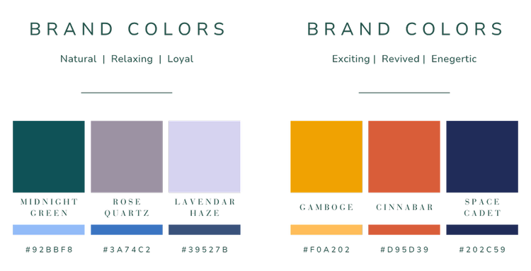
The two palettes above show how dramatically different emotions can be communicated through color.
Palette Left: Natural, Relaxing, Loyal Palette
The first brand board on the left, featuring Midnight Green, Rose Quartz, and Lavender Haze, creates a palette that feels calm, grounded, and trustworthy.
Midnight Green conveys stability and reliability, making it an excellent anchor shade for service providers who want to inspire confidence.
Rose Quartz introduces a touch of warmth and softness that feels approachable and human-centered.
Lavender Haze brings in a dreamy, relaxing energy that softens the overall look.
This combination is perfect for small business owners who want to position their brand as dependable and thoughtful. Think of coaches, wellness providers, or creative entrepreneurs who want clients to feel safe and supported. These tones communicate balance, loyalty, and ease, making them ideal for a brand voice that values connection and trust.
When you are choosing your palette, ask yourself both questions. Does this palette look intentional together? And does it send the emotional signal I want my clients to feel?
Palette Right: Exciting, Revived, Energetic Palette
The second brand board, with Gamboge, Cinnabar, and Space Cadet, has an entirely different effect.
Gamboge, a bold golden yellow, radiates energy, enthusiasm, and optimism.
Cinnabar, a vibrant orange-red, brings excitement and passion, encouraging action and forward movement.
Space Cadet, a deep navy, provides the grounding this palette needs, balancing the bright tones with a sense of professionalism and authority.
This palette is ideal for brands that want to inspire action and momentum. It works well for entrepreneurs who want their websites to feel bold, modern, and motivational. Think personal trainers, event planners, or creative service providers who thrive on high energy and want to attract clients ready to take the next step.
Why Color Theory Matters for Your Brand
Both palettes above are beautiful, but they tell two very different stories.
The natural palette says “I am calm, consistent, and here to support you.”
The energetic palette says “I am bold, creative, and ready to help you make big moves.”
When you understand the emotional impact of brand colors, you can choose a palette that not only looks cohesive but also resonates deeply with your dream clients.
If your brand needs to convey trust, safety, and intention, the natural and relaxing palette is your match. If your brand thrives on excitement, creativity, and bold action, the energetic palette will help you stand out and connect instantly.
Practical Steps: Choosing Your Small Business Brand Colors with Intention
How to Approach the Brand Palette Design Process:
Start with emotion, not aesthetics.
Ask yourself: What do I want people to feel when they land on my site? Calm? Excited? Inspired?
Pick a “hero” color.
This is your anchor. It is the color that represents your brand’s energy.Build supporting players.
Add two or three complementary or analogous colors that enhance your hero color without competing with it.Balance with neutrals.
Do not underestimate the power of whites, creams, or charcoals. Neutrals are what make your accent colors shine.
Final Thoughts: Your Palette Is Part of Your Story
At the end of the day, color theory is less about rules and more about creating alignment.
Your palette should feel like home for your brand. It should feel authentic to you, intentional for your clients, and consistent enough that people recognize it instantly.
And if you are tired of second-guessing your DIY colors, that is where I come in. I help small business owners create Squarespace websites and brand palettes that do more than look beautiful. They connect and convert.
Ready for colors (and a website) that feel like you?